
The Colourist
This week's shoot and processing has all got a bit meta and self-referential as I find myself colour-grading a photo I've taken of someone who is colour-grading.
Mark, pictured, is a Colourist for Sky Television. He spends his working days in a dim, neutrally coloured room working with video, and I spend my nights colour grading in my similarly decorated loft. Although his work is with video and mine is with still images our purpose is very much the same: to add to the narrative of an image by crafting its colour palette to set the mood and tell the story.
As I prepared to take portraits of Mark at work, I noticed a copy of Patti Bellatoni's book, "If It's Purple Someone's Gonna Die" on the table next to the client sofa at the back of his colour suite. I referenced this book a lot during my MA and have a well-thumbed copy on my bookshelf at home. In it, Bellantoni explores the incredible impact that colour has on our feelings and mood and how, as visual artists, we can use that to add to a narrative in the same way that a composer does with a score. Colour is an extraordinarily powerful part of the visual storyteller’s toolkit. Note, for example how Tom Hanks is slowly enveloped in the red of the fire from this scene in Philadelphia…
Philadelphia. (1994). Columbia TriStar Film.
Bellatoni describes this amplification of colour as "rubbing visual salt into an emotional wound", that while Hanks is talking about love and life it is the colour that speaks for his real emotions. It speaks for his rage, and his pain.
Photography lacks movement, a soundtrack and, in some cases, also lacks words, so colour is an important consideration that I apply to my fine-art work but also the private and corporate commissions I take on.

Unprocessed image, shot RAW and processed as Fuji Pro Neg Hi film emulation
This shot of Mark is part of a project I am producing for an organisation called the Digital Production Partnership (DPP), wherein I am building a visual library of the people and technologies involved in broadcast and media production. It's an area of work that is not easily found in standard image libraries and the photographs will be used in presentations, reports and online to talk about their work.
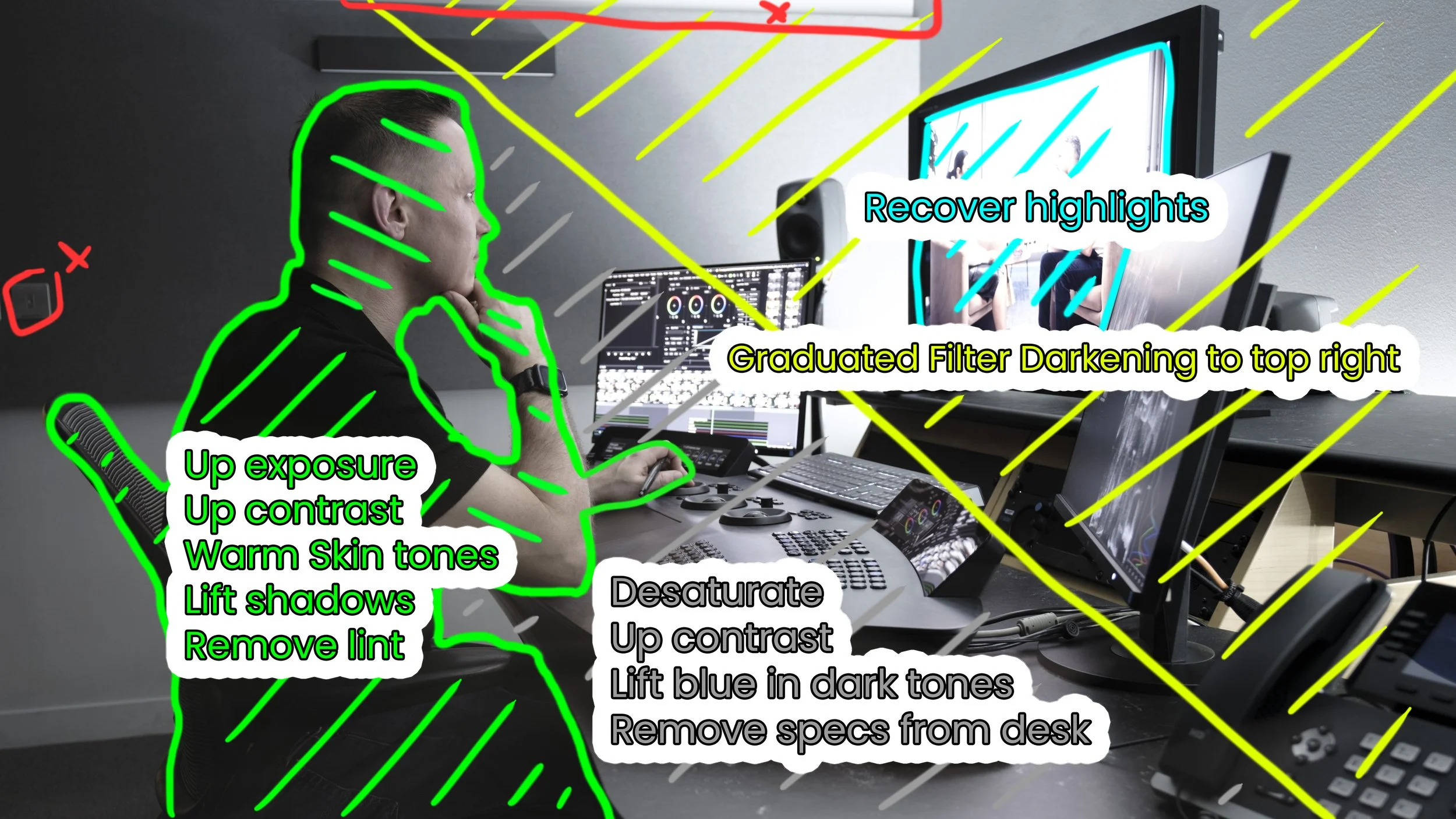
Annotated markup of colour grade and cleanup
Mark’s job is creative but also inherently very technical. As the image is for corporate use I can't go too overboard on how I treat colour for narrative purposes, but I do want to nod to those two elements of the story; the blend of human and technology. I don't usually show my processing but this seems like a good opportunity to touch on the work that goes into an image after its been taken, even for something that is not destined for a gallery or customer's wall.

Final image
You'll notice that, as well as distinct changes to contrast and exposure the technical areas depicted in the image echo the greys and blues you'd find in sci-fi films like Arrival for depicting aliens and their technology, or and Alicia Vikander's character in Ex Machina. Mark's skin tones however retain the humanity and warmth of a film like ‘Oh Brother Where Art Thou’, yet without the yellowy dustiness of the American West.
Due to the nature of this project I don't know how this image will eventually be used. The DPP are all about supporting the human aspects of collaboration in media production by supporting the technical complexity that underpins the whole industry. This colour grade aims to reflect that purpose.
It is one of a few hundred images in the project that have undergone similar consideration.
Reference list
Bellantoni, P. (2005). If it’s purple, someone’s gonna die : the power of color in visual storytelling for film. Amsterdam ; Boston, Ma.: Focal Press.
Philadelphia. (1994). [Film] Columbia TriStar Film.