
Making ‘Forever Autumn’
It was earlier this year in September that, with another lockdown imminent, the ability to work with models inside, even in a limited capacity, seemed to be about to go away again.
In making portraits with lights and reflectors I’d shied away from taking my practice outside but world events have forced me to expand my ideas. Shooting outside immediately adds some sort of context, an environment, and a wider narrative that I wasn’t sure I was ready to introduce yet. The easiest location for me to shoot in is Richmond Park but images of models in nature conjures up the work of Brooke Shaden or other complex composite image makers.
This MA is all about experimentation and getting out of my comfort zone so in that spirit I spent an early autumn morning location scouting for a shoot I had planned with a friend who was eager to model so long as it was "slightly crazy and interesting".
My hunt was for 'old trees or symmetry', and whilst symmetry was somewhat absent from the places I scouted I did find some characterful trees…


But it was only towards the end of my scout that I found the most inspiration and it wasn't from nature at all. The wall that encloses the park offers a very interesting backdrop…
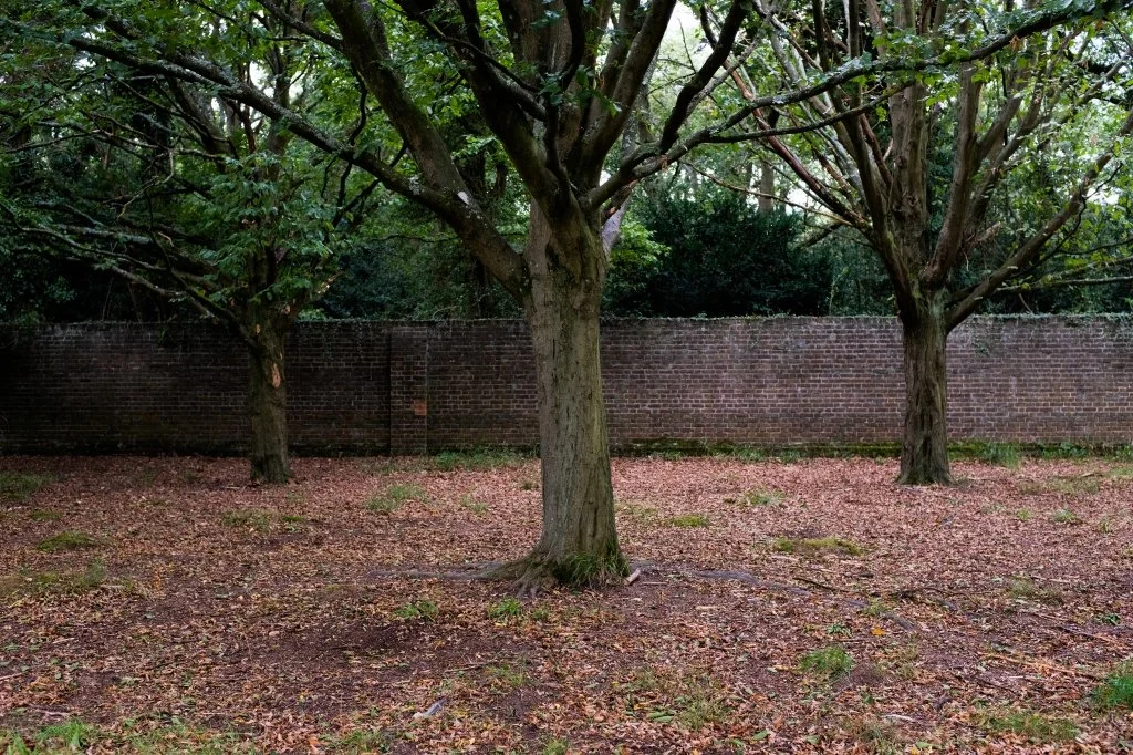

The age of the wall plus the feeling of it cutting through nature and not being ‘of the place’ could, I thought, add some interesting tension to a portrait session. There are a few stretches of the wall that are quite clear and off of the main route that walkers and cyclists use, so would work well as an outside studio space.
Over Christmas we have been enjoying some classic films including George Lucas' 'Labyrinth'. Brushing over the strong occult symbolism and its citing as an allegory for Monarch Mind Control, Emma and I got talking about how similar the narrative of the film is to the lockdown experience: one challenge after another and an environment where rules are constantly changing.

(Labyrinth, 1986. Lucasfilm)
Inspired by this combination of unpredictability and continuous entrapment I set out to use the wall in the park as a set to emulate one of the scenes from the film. Although there is only one wall I figured that by shooting it from two directions and compositing these two 'halves' together I could create the impression of a seemingly endless walled path.
We tested the concept in early December by taking a couple of images whilst out on a walk and sticking them together very roughly in Photoshop, just to see if the composite worked. Posting the resulting test on Instagram seemed to resonate well with those who saw it, both from a illusory perspective but also as an image that caught the feeling of the moment. I was happy that the concept seemed to capture the atmosphere I was going for, particularly as we have just entered a Tier 4 lockdown across most of the South of the UK.

Cranefield, R. (2020). Lockdown Maze Test Composite.
Other than sticking two photos together with a rough mask nothing else was done to this concept sketch. The full image required a lot more planning and care, so we went back a few weeks later to do a full shoot to make the images needed for the final piece.
I have been spending a lot of time over Christmas reading and learning about colour theory. An aspect of art that i already understood from my A-Levels and Foundation in Graphic Design but, as that was 30 years ago I had never really connected it to my photography work. In photography my aim has always been to replicate colour accurately, rather than to manipulate colour to create a more harmonious image or create a mood. This is the first image in this series where colour theory has become part of the shoot planning.
Key sources in this regard have been 'The Science Of Color', by Kate Woodman and 'Commercial Color Grading' by Sef McCullough, both of which are published on Pro Edu.
There are some colours in this shoot I cannot change a great deal in post: the red of the wall and the dark browns of trees and ground. Whilst not entirely fixed our limited selection of clothing also poses some restrictions on the colour palette and have forced decisions about how colour harmony could be achieved.
I want Emma to be wearing her normal clothes, rather than go all-out-fairytale and put her in a flowing white dress. The intent is to create an image that documents the now that may resonate with other children about their current modern predicament and not cast it as something set in a far away land.
As red and deep browns were going to be the predominant colours in the backplate we've come up with a wardrobe that will work in that setting.

The defining piece of her costume for this image is 'the hoody', in order to set this very much in the now. With a limited selection of these to hand we've gone for one that is light blue as it will bring the most pop and contrast against the winter backdrop. Blue is also a perfect colour for depicting sadness or detachment. In her book 'If It's Purple Someone's Gonna Die', Patti Bellatoni describes blue as “the quintessential color for powerlessness”. (Bellantoni, 2005, p.82). She cites Dorothy’s dress in The Wizard of Oz as being a great example of the use of color to define a powerless character.

Hulton Archive (1939). Judy Garland as Dorothy Gale in “The Wizard of Oz”,
“Dorothy’s pinafore was a blue gingham-check, which reads as pale blue. Year after year, our investigations revealed that the paler a colour I, the more powerless it is”
It seems fitting then to use the blue hoody as an indirect reference to the character of Dorothy, who is also lost and confused, and to cast Emma as somewhat powerless in the context of the image.
The challenge with using just blue against the reds and browns of the background is that blue isn't a direct compliment. The image would be slightly unharmonious unless a yellow is added to create a balance. We didn't have a brick road that we could use so we've found a polo shirt that Emma never wears.

Adobe Kuler colour harmony plan for 'Forever Autumn'.
Adding something yellow creates what is essentially a Split Complimentary. Whilst I would never have chosen it for style Emma only owns this one yellow top so that is what we used to complete the wardrobe and the colour balance.
Given the wet winter we are having it was no surprise that the shoot site was pretty muddy to get to and as we left it until the afternoon to get there the winter the light was fading pretty quickly. The fading light led to some aspects of the shoot feeling a little rushed. I was aware that I needed to shoot two portions of the wall and that they needed to appear to be shot in the same light and have the same depth of field in order to work. When we shot we were losing about a stop every 20 minutes.
I used a Godox remote controlled strobe in a large rectangular softbox feathered onto Emma. The wall is dead straight, obviously, but as I wanted it to be angled in the final shot I chose to do this "on set" by tilting the camera rather than do it in post. I wanted to be able to see that the way Emma held herself and the way the weight ran through her legs looked natural if the wall was actually as angled as I depicted it and she was leaning against it.

I made sure I had created a few possible viewpoints with Emma looking at the camera; at the top of the imaginary wall opposite her; and looking down into the passage, as it wasn't clear to me which approach would best convey the intent of the image and I wanted to be able to make those decisions once back at my desk.
In order to get the eye-line correct when looking at the top of the opposite wall I had my wife hold up a lighting stand to the height of the other wall so that Emma could look at it and if pondering the possibility of climbing over it rather than just staring blankly up into the sky.


Back at my desk and playing around in Photoshop, it took a little while to get the right composition for the ‘Forever Autumn’ image and in the spirit of “done is better than perfect” I have eventually left it as is, with two versions with a subtle difference.
Although I barely moved the camera during the shoot I did try a few focal lengths so ended up with a left hand wall that I really loved but the pose that I wanted to use of Emma was from a slightly different lens position. An amateur mistake really, shooting on a prime lens would have prevented me from doing this; it’s all a learning experience.
This video shows a build of the layers in the final composite…
Although the video shows how the final piece coming together from different elements, it doesn't really give a sense of the length of time taken in building the masks that blend each layer.
The most notable elements are the drop in of the 'facing away' pose against the preferred version of the left wall. Although the right hand wall was from a different part of the park it did face the same direction so it had the same growth of moss along the base, I put a curves layer on the moss to take out the green and make it look a little more dead, implying that the sun didn't hit that side of the passage. The contrast of both walls was increased a little to make it a little more cinematic and a very slight blue wash applied to cool the image.
Although it has taken a while to build this image most of that time has been in contemplation. Going through a cyclic process of making some edits, rendering the image, and then printing it or having it as my wallpaper for a few days to give it some consideration before moving on. Replacing parts that were not working, finessing the elements that seemed to be coming together well.
I created a second version of this image to enter into the Lens Culture Portrait Awards, 2021
The original version, and the one I will keep in my portfolio for the project, has Emma looking down the passage away from the camera. This is, to my mind, a more contemplative pose, it stops the image from being a portrait of what she looks like and takes the viewer into what it feels like. The viewer’s gaze may start with her as the subject but her gaze leads the viewer’s eyes into the tunnel and the confused mass of vegetation as the path becomes less clear, the end not in sight.

For the LensCulture Portrait Awards I created a second version of the image with Emma looking at the camera. I felt this sat better with the theme and expectations of that competition with the image removed from the context of the wider project.

I'm still not sure if this was a good decision and feel that maybe I should have stuck with the original image and its intent. I think most creators agonise about elements of their work or even the success of the entire piece. The trick with personal projects is, I think, to take the learning from the process more than focus on the final outcome. That is, however, easier said than done.
For the award submission I described the image as follows...
““Forever Autumn” is part of a collaborative project with my daughter that seeks to depict the psychological impact of isolation on children and teenagers. Inspired by Jim Henson’s ‘Labyrinth’ this image depicts the seemingly endless lockdown. Trapped in a maze where the rules keep changing and over which children have no control.”
In describing the wider scope of the project I stated that...
“This image is part of a project that seeks to depict the impact that Covid lockdowns are having on children. The works within the project are produced in collaboration with my daughter.
Each image is inspired by an event, film or work of art that has led to conversations about how she feels at this time. Whilst this image focusses on endlessness and lack of agency other themes in the project have touched on anger, loneliness, and the internet as the only escape.
Studies suggest that there could be long term mental health issues in children following this sustained period of isolation and stress. My hope is that the images that result from the project can be used in a therapeutic context as well as an artistic one..”
Reference List
Bellantoni, P. (2005). If it’s purple, someone’s gonna die : the power of color in visual storytelling for film. Amsterdam ; Boston, Ma.: Focal Press, p.82.
Cranefield, R. (2020). Lockdown Maze Test Composite. https://www.instagram.com/p/CJEAO34obiQ/?utm_source=ig_web_copy_link. Available at: https://www.instagram.com/p/CJEAO34obiQ/?utm_source=ig_web_copy_link.
Hulton Archive (1939). American actress and singer Judy Garland (1922 - 1969) as Dorothy Gale in “The Wizard of Oz”,. https://www.gettyimages.co.uk/detail/news-photo/american-actress-and-singer-judy-garland-as-dorothy-gale-in-news-photo/57633039
Kate Woodman (2018). The Science of Color | Kate Woodman Portrait Photography Tutorial PRO EDU. Pro Edu.
Labyrinth. (1986). Lucasfilm.
(This blog entry was written as part of my Master’s Degree in Photography and forms part of an academically assessed work.)